
Tea Knowledge
Tea-Bag Brewing Icons: A Clear Instruction Card for Overseas Gifts
A little preparation leaves more room to enjoy the tea.
A tea-bag brewing card should not ask a recipient to guess what a charming icon means. When the recipient cannot read the source language, the useful card is one that supports an action: one icon, one action; water in ml; temperature in °C; time in minutes or seconds; and an explicit instruction to remove the tea bag. If product information is missing, leave a blank for the real value. Do not invent a universal tea-bag recipe just to make a layout look complete.
Treat every icon as one action
Use a simple sequence: put in the tea bag, add __ ml water, use __ °C water, wait __ minutes __ seconds, remove the tea bag, enjoy. A bag icon means the bag goes into the cup. A measuring icon means water amount. A thermometer means water temperature. A timer means waiting time. An arrow lifting the bag means removal. The cup means drinking; it does not silently promise a particular mug size, water temperature, or flavour.
This restraint matters because one crowded picture may be attractive yet unhelpful. A hand, steam, a cup, a timer, and a bag combined in one illustration can be read as “make tea somehow.” A recipient needs to know what happens first and what happens next. Put the sequence left to right or top to bottom according to the reading direction of the market, and print the same order in words.
The icon-semantics table
| Icon | Single action | Text or number that must accompany it | Do not assume |
|---|---|---|---|
| Tea bag entering cup | Put in one bag | Actual product serving count | Every bag has the same weight |
| Water drop and measure | Add water | __ ml | Every cup holds the same amount |
| Thermometer | Choose water temperature | __ °C | All teas use boiling water |
| Timer | Wait | __ min __ sec | Everyone reads an hourglass alike |
| Lift-out arrow | Remove bag | “Remove tea bag” in local language | Leaving it in changes nothing |
| Cup | Drink | Heat warning where needed | The icon replaces safety wording |
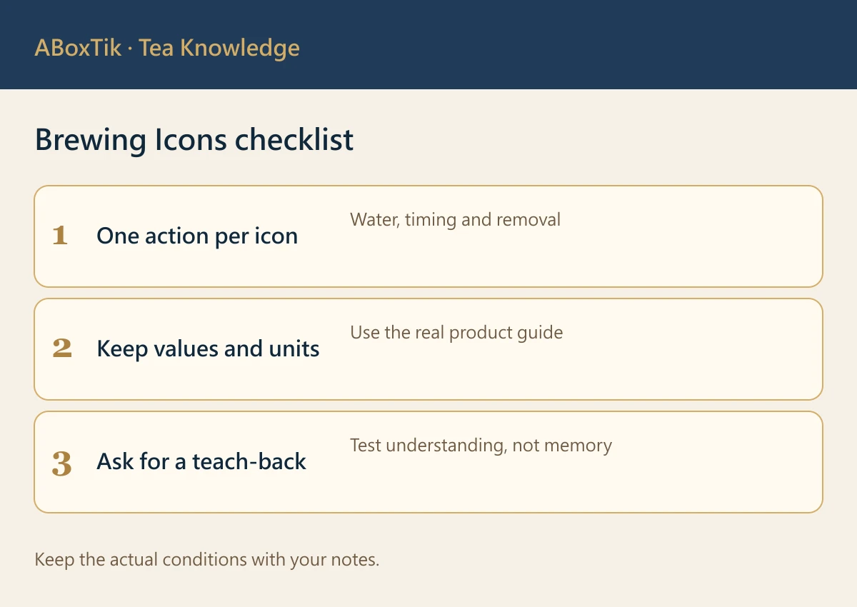
The blanks are deliberate. A designer should fill them only after receiving the product’s actual brewing guidance. If a product card gives different guidance for cold brewing, a larger serving, or a second infusion, create a separately labelled path; do not hide it inside the first cup icon. Product guidance always overrides a generic card.
Numbers make an icon usable
The difference between a friendly card and a guessing game is often a unit. “Water” is not enough when a recipient must decide between a tiny tasting cup and a large mug; write the actual ml amount. “Warm” is not enough when the product specifies water temperature; write °C. “Wait” is not enough; state minutes and seconds. “Take out” should say the tea bag is removed, not merely show an arrow that might be read as stirring or serving.
When a value is not supplied by the tea product, leave a visible blank in the draft and return it to the product owner. A blank is an honest production question. A made-up value becomes misleading printed instruction. This is especially important when one gift box combines different tea bags: each variety may need its own verified line, or a clear link to its own information.
Icons still need words and language assistance
The W3C WAI image tutorials explain why images on the web need text alternatives and, for complex information, an explanation that communicates the same essential content. Those tutorials are accessibility guidance for web content; they do not certify a physical package. Their underlying lesson is still useful here: an image should not be the only path to essential information.
Print the core instruction in clear text alongside the icons. Add the recipient market’s usual language or languages, and offer a QR link to a maintained text version, translation support, and product contact information when appropriate. Do not assume icons are universally understood. The most easily misread concepts are often removal, temperature, portion, and the direction in which steps proceed. A text alternative is not decorative backup; it is a second route to the same action.
Build the card from verified product data
Start with a small content brief: product name, serving count, water amount in ml, water temperature in °C, steep time with units, remove action, any required warning, and source language. Confirm those fields with the actual product guidance. Then decide which language appears on the physical card, which version appears at the QR destination, and who owns future updates when the product changes.
Fictional design example, not a brewing recommendation: “1 bag → __ ml → __ °C → __ min __ sec → remove tea bag → enjoy.” The fields remain empty until verified product data arrives. A translated version carries the same action and number; it does not translate a guess into a second guess. Including product name and storage information helps a recipient identify what to check if the card and box ever become separated.Propose a teach-back check before print
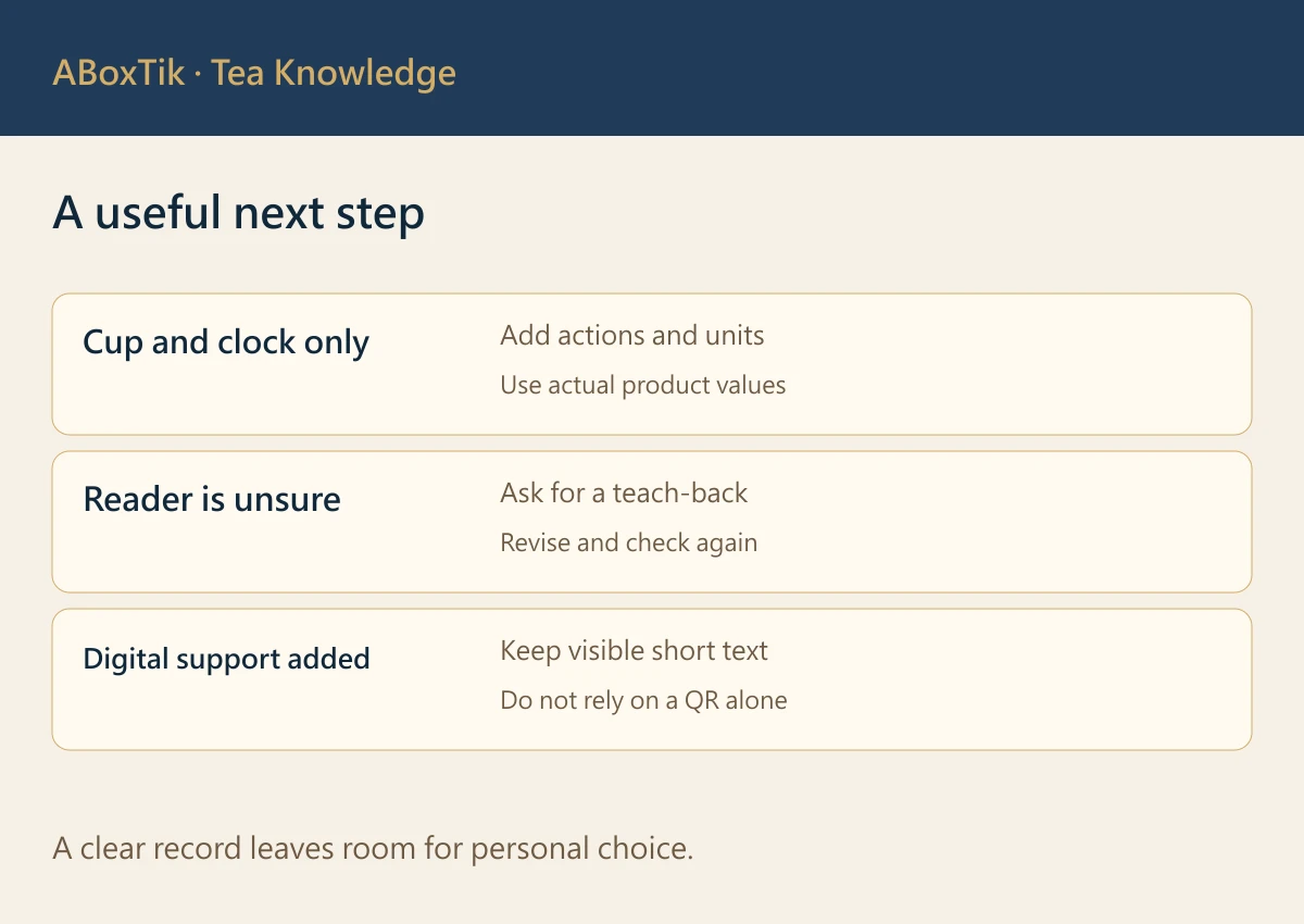
A useful pre-print test is a teach-back exercise. Ask someone who has not read the source language to look at the draft card and explain, in their own words, what they would do first, how much water they would add, how hot it would be, how long they would wait, and when they would remove the bag. If they can only say “steep it for a while,” the card lacks a value or a unit. If they treat an icon as decoration, adjust the label, order, or text.
This is a proposed test plan, not a claim that any recipient has been tested or that a result has been achieved. Record the version shown, the questions asked, and the changes made after feedback. Test language assistance too: can a person find the text alternative or QR information without being told where it is? A card that works only after an explanation from the giver has not yet carried its own weight.
Keep the card calm at the point of use
Avoid turning the front of a tea gift into a wall of instructions. Put the six essential actions on the visible card and move background detail—origin story, marketing copy, extra serving ideas, or extended translations—to a linked page or an enclosed leaflet. The short card should be readable while holding a cup. Large type, sufficient contrast, clear spacing, and an unambiguous sequence are more useful than extra ornament.
The warmest tea-bag card does not perform cleverness. It gives a recipient who cannot read the original language enough reliable information to make a first cup without embarrassment, then leaves room for their own pace. Gather the actual product data first; let the icons, numbers, words, and language support all tell the same small, practical story.
Keep water temperature before the pour
If the card shows water quantity and temperature as separate symbols, explain that they describe the same water addition. Check the appropriate temperature before pouring, rather than implying that the recipient should add water and only then decide how hot it needed to be. Define the timer start according to the actual product guidance as well. A small sequence correction can be more useful than another decorative icon.
Hand over a version, not just an artwork file
Keep an internal version number, source owner and approval date with the draft. If tea quantity or preparation changes, update the physical card and linked page together. A recipient should not find one set of values on paper and another after scanning a code. For a mixed gift, identify each tea in words rather than relying on colour alone.
For a hypothetical production hand-off, imagine that one tea has confirmed water quantity but no confirmed time. Leave the missing field as a question for the product owner; do not borrow the other tea’s time. Check translated serving counts, numbers, units and removal actions one field at a time. This is an editorial example, not a product formula.
Review the artwork at its intended printed size. Keep essential actions visible without requiring a phone or internet connection, and offer the digital page as an additional route. Ask the reader what they would do first, then ask which symbol led them there. Record the answer and revise the card if needed. Welcoming a question is often more useful than making the card look effortlessly clever.
Related reading and tea choices
Sources
- W3C WAI, Complex Images Tutorial
- W3C WAI, Images Tutorial